Is it Too Soon for 2024 Hugo Data Analysis?
Tuesday, July 23, 2024 - 19:19
Purpose
The recent announcement from the Glasgow Worldcon committee about some unexpected patterns in Hugo voting ballots, the conclusions made about those patterns, and the actions taken in response, have naturally raised interest in the nomination process for this year. As readers may remember, both the nomination process and voting process in 2023 had clear anomalies that cast severe doubt on the validity of the outcome and generated a great deal of concern among the SFF community.
The Glasgow committee’s commitment to openness and transparency with regard to data and communications has been highly appreciated. Because of that, I have every confidence that if they had observed anomalous patterns in the nomination data (as they clearly did in the final voting data) they would have taken appropriate action. But can we back that confidence up with any hard data, in advance of having access to the full nomination and voting statistics?
In response to some questions thrown out into the ether by ErsatzCulture, I opened up the historic trend analysis spreadsheet I created at the beginning of this year and plugged in the data we have available at this point. For each category, that data consists of:
- Total number of ballots with any nominees in the category
- Total number of distinct nominees mentioned for the category
- Maximum and Minimum nominations for finalists in that category [1] [2]
[1] Keep in mind that the calculation process for determining finalists is not “first past the post” but involves multiple rounds of data processing, with the result that an item that makes the finalist list may have fewer direct mentions than an item that fails to make the list. This process is too complex for me to explain here.
[2] Some potential finalists declined the nomination. It would make sense that these are included in the stats—possibly including the max/min stats. Some nominated items were determined to be technically ineligible and are therefore (presumably) not included in the max/min stats, but probably are included in the overall ballot/nominee numbers. (The difference wouldn’t be significant for distinct nominees.) When the full stats are available, I’ll update with the complete numbers, but for now this will be an approximation.
Methodology
I selected the following years to analyze:
- 2011 - the earliest year I happen to have data for
- 2012 - the last year before any Sad Puppy [3] activity
- 2015 - the year of the most intense Sad Puppy activity with known nomination slates
- 2017 - the first year of E Pluribus Hugo [4]
- 2021 - a recent year
- 2022 - a recent year
- 2023 - the Year of Shenanigans
- 2024 – the current year
[3] If this reference means nothing to you, count yourself lucky. But in that case, you probably aren't that interested in deep dives into Hugo Award data.
[4] Because I'm looking only at "how many nominating ballots included this item" the difference in how those nominations are processed pre- and post-EPH should not be significant, except to the possible extent that it affects how people nominate.
Note that Best Fancast and Best Series were added at various times during the scope covered by this study and so are not present in all the graphs. Best Game is new this year and is not included as there is no comparative data.
Because the available data for 2024 is limited at this time, I’ll be looking only at the following questions:
- How do overall numbers of nominating ballots (in each category) compare to the selected previous years?
- For the finalist on the largest number of ballots, how does their percentage of the total nominating ballots for that category compare to previous years?
- For the finalist on the smallest number of ballots, how does their percentage of the total nominating ballots for that category compare to previous years?
- How does the range in percentages between high and low finalist compare to previous years? (This will stand as a proxy for the slope of the top end of the nomination distribution.)
Analysis
Total Nominating Ballots by Category
Yes, yes, the figures are very hard to see at this scale. But to some extent that’s a feature, not a bug. Because we’re looking at overall patterns, not specific numbers. It makes it easier to see an overall pattern and the items that break that pattern.
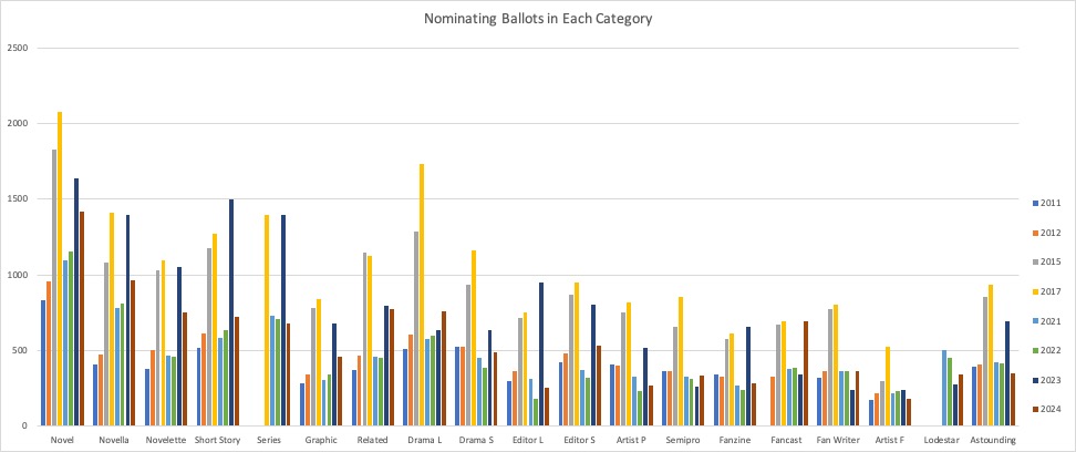
Overall, in the fiction categories, plus Related Work and Drama-Long, there is generally a steady increase in numbers of ballots across the study, with starkly higher numbers in 2015 (puppies), 2017 (E Pluribus Hugo) and 2023 (Chengdu). The other categories are either running fairly steady or have no clear trending pattern, again with the exception of the specified years.
What breaks this overall assessment? Best Related Work is out-of-trend in 2024, with total ballots almost as high as 2023. Fancast is also out-of-trend with the highest number of ballots in my data set (and this was not a category with unexpectedly higher numbers in 2023). Other than these two categories, nothing jumps out as unexpected when viewed in the historic context.
Percentage of Ballots for Top Finalist
The next pattern to examine is the percentage of ballots (out of those with any nominees in the category) that listed the finalist that appeared most often. (I’m trying very hard to find concise language that doesn’t imply value judgments.) Again, I’m going to start with a high-level graph that is more for the shape of the patterns than the specific numbers, but this time I’m then going to break it up into groups for better visibility.
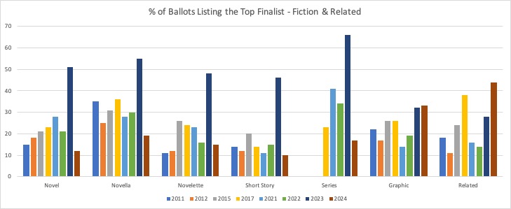
The analysis here is that there’s normally a relatively narrow range for the percentage of the top finalist—mostly between 10-30%. For a number of categories, 2023 significantly breaks this pattern with much higher values. But 2024 not only returns to “normal” but in most cases has a lower top percentage than in previous years.
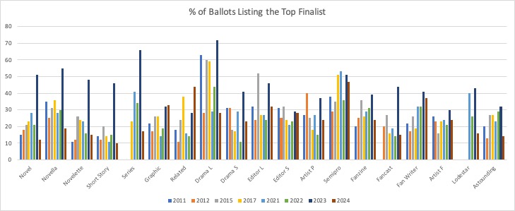
The category that breaks this pattern is Best Related Work, where 2024 had the relatively most popular “top performer” of the data set. It’s not only higher than the anomalous 2023 value, but also higher than the previous peak in 2017. (Looking back, this points out that sometimes there’s simply a run-away favorite, especially in a category with a relatively limited set of known candidates. That runaway favorite in 2017 also won the final ballot on the first round of counting.)
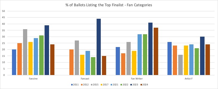
In the fan categories, it’s interesting (but perhaps not meaningful) that Best Fan Writer currently appears to be increasing focus on the top performer, but not in the same stand-out sort of way. And given the previous observation that Best Fancast had an unusual spike in numbers of total nominating ballots, this doesn’t appear to be due to a runaway favorite, as the most popular nominee appears on only 15% of the ballots—almost the lowest in my data set.
Percentage of Ballots for Bottom Finalist
The next question has some sharper, but less interesting, patterns. What percentage of ballots list the finalist who has the lowest number of listings? This is a much tighter range—eyeballing suggests mostly around 7-12%. Again, I’ll start with the high level overview where the overall pattern is clearest. What’s clear, is that all the most significant out-of-trend items are from 2023. The pattern is much starker that the higher percentages for the top finalist.

In fact, let’s flip the data to cluster by year rather than by category. (Due to the nature of my spreadsheet, the years are numbered in order rather than labeled by year—see the key above.) Here it’s easy to see that 2023 had overall higher percentages for the low finalist. But we can also see that 2024 is running lower than typical for the low finalist. (There are various possible hypothses that would explain this, but I’m not going to speculate until I have the full data.)
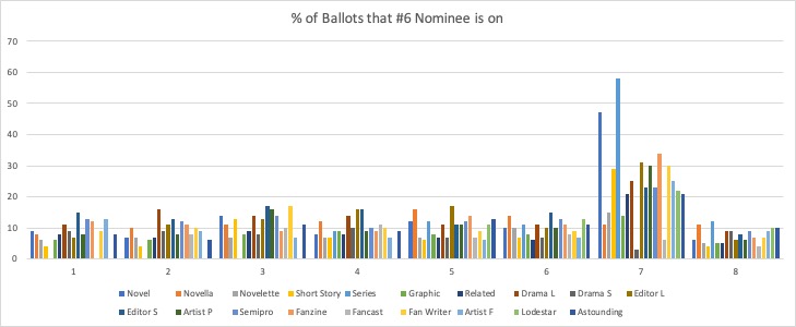
I’m not going to zoom in on this one because, frankly, it’s not that interesting.
Span Between High and Low Finalists
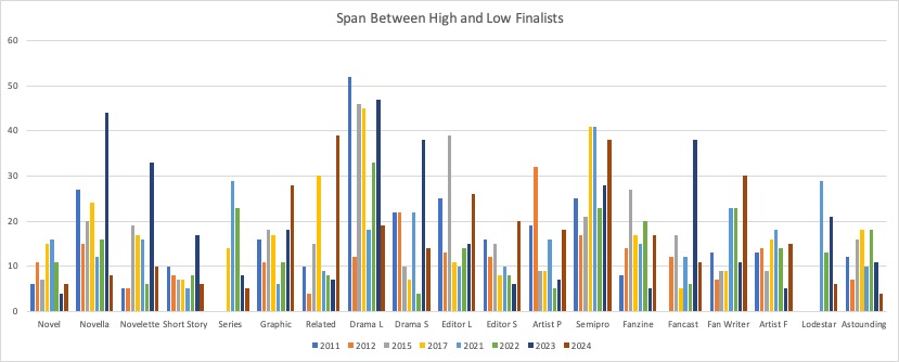
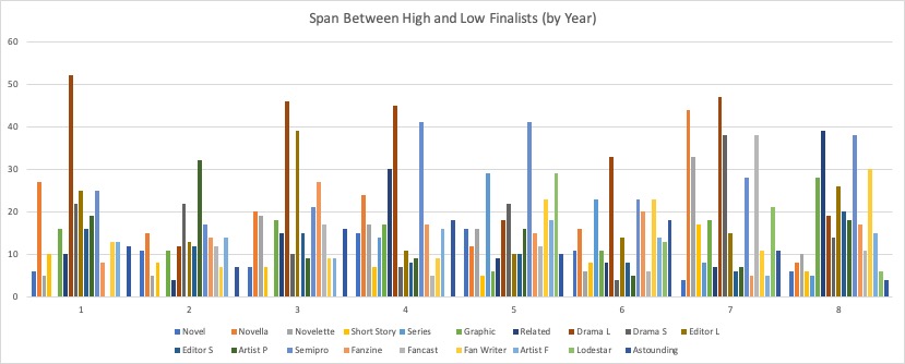
When I put together the data showing the difference in percentages between the high and low finalists, I thought it would be easy to interpret, but it’s actually rather complex and requires a number of individualized explanations to make sense of. I’ll put up the high-overview graphs grouped by category and by year, simply because I have them. But I’m not seeing anything meaningful to say. 2024 seems to be running to larger spans in everything but the fiction categories, but I don’t know what that means.
With regard to the two categories that seem most interesting, Best Related Work has a large span, indicating either a very sharp tail-off or a runaway favorite. Fancast has an utterly typical span.
Conclusions?
To sum up, there are two categories that stand out as having at least one unusual feature. Both Best Related Work and Best Fancast have a larger number of nominating ballots cast than history would predict. However while the top finalist in Best Related Work appears on an unexpectedly high % of the ballots and has a larger-than-typical difference from the bottom finalist, the % ballots for the top Best Fancast finalist is not merely typical, but lower than usual, and the span between top and bottom finalists is utterly typical.
Best Related Work is a category that has historically been rather variable in performance, and there have been previous instances of clear favorites as early as the nominating process. Given that we can assume the total nominating ballots include withdrawals, and presuming that the max/min stats also reflect pre-withdrawal data, it is plausible that the bump in the Best Related Work category reflects the peculiar virality of one nominee who declined nomination.
But another explanation might come from one nominee that appeared in both Best Related Work and Best Fancast, but was ruled ineligible for the latter. (I know in some circumstances a work nominated in two categories can have nominations moved to the more numerous category, but I don’t know if that would happen with eligibility issues. So I don’t know how/if that would affect the numbers.) A second item nominated in Best Fancast was also ruled ineligible (in both cases, on the basis of being professional productions). If the nominations were counted under “total ballots” but were excluded from the max/min data, that could explain why the nominating numbers were unusually high without it being reflected in the popularity of the top finalist.
Anyway, that’s as much as I can make of it at the moment. Any potential relationship of the above analysis to the question of which finalist was the beneficiary of attempted ballot-stuffing is left entirely to the reader’s speculation. It may be related, it may be entirely unrelated. There are a number of high-level theories about what the purpose of the attempted ballot-stuffing was, and each theory would have an entirely different potential relationship to nomination patterns.
Major category:
